QR codes used to be the ugly stepchild of design those black and white squares you slapped onto a poster because the client asked for it. That's changed. In 2026, the best ones are actually designed.
Why Creative QR Codes Matter in 2026

A standard code works. It gets you from A to B. But does it make you want to scan? Not really.
Design turns a utility into a moment. I've seen claims that creative designs pull up to 40% more scans, and I buy it. If someone sees a code that actually looks interesting, they're more likely to stop and pull out their phone. The trick is making sure that "interesting" doesn't break the scanner.
Design Trends That Actually Work
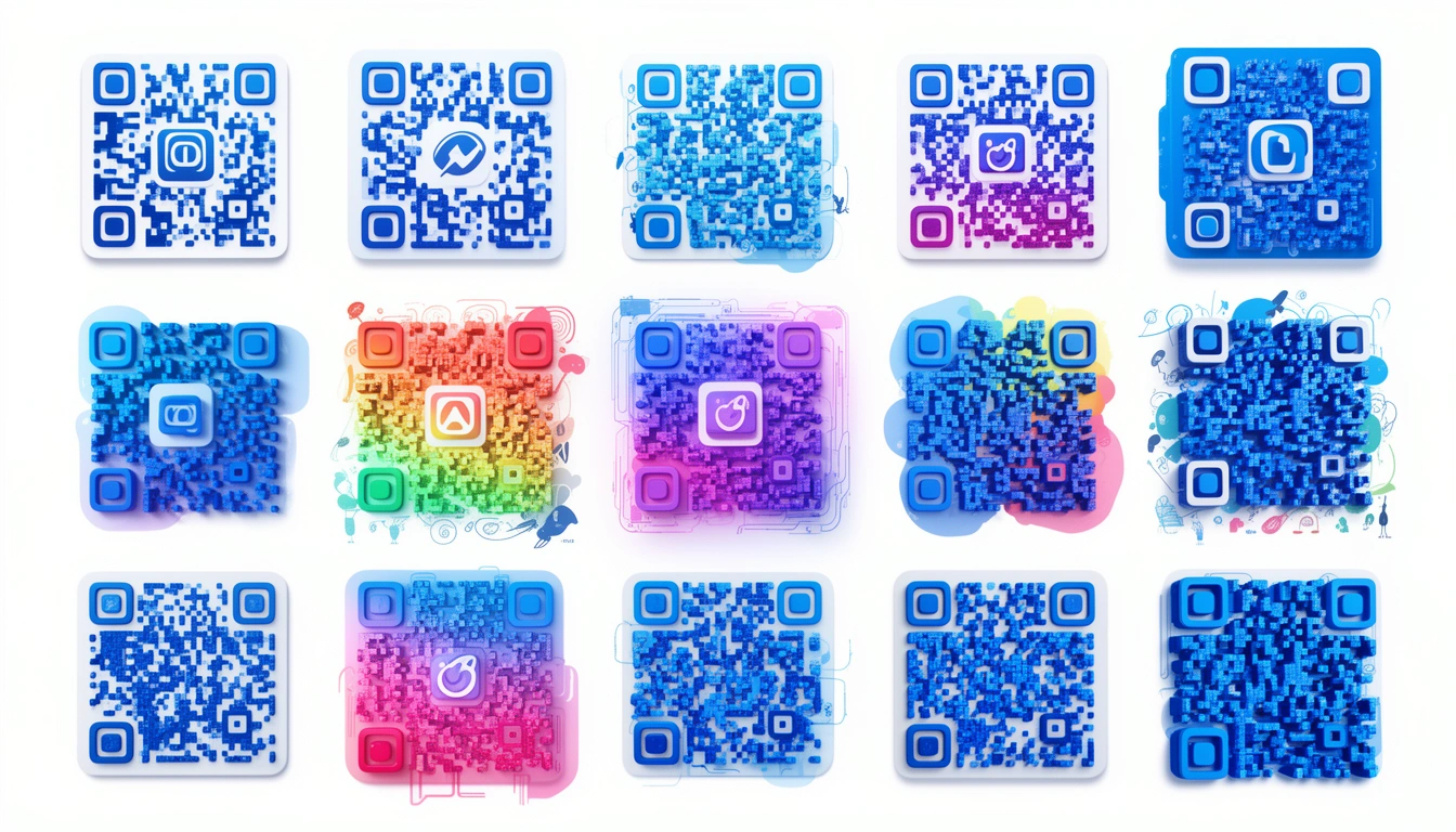
Logo-Integrated Codes
The easiest win is dropping a logo in the center. It looks professional and scans reliably because the error correction covers the middle. Big players like Nike and Starbucks do this constantly. You can create QR codes with logos in the center in seconds now; the tools are smart enough to optimize the placement so you don't get dead zones.
Color and Gradients
Flat black is out. Brands are using gradients sunset fades, neon transitions, full brand palettes. Just remember contrast. If the scanner can't distinguish the dark modules from the light background, it fails. Aim for at least 40% contrast.
Animated Codes
On digital screens, you can get away with motion. Pulsing effects, color shifts, or small loops. They grab attention on Instagram Stories or digital billboards where everything else is static. For marketing campaigns, that movement can be the difference between a scroll-past and a scan.
Artistic Collaborations
This is the high-effort approach. Some brands hire illustrators to turn the code into a watercolor piece or a geometric sketch. The code becomes the art, rather than sitting next to it. It's popular with luxury brands that refuse to look "techy."
Custom Shapes
Square is default, not law. Custom QR code shapes circles, rounded blobs, hexagons are gaining traction. The algorithms are finally good enough to maintain the scan reliability even when you mess with the outer frame.
Texture and 3D
Physical products deserve physical codes. Embossed codes on packaging or business cards feel premium. They also help with accessibility; if you can feel the code, you can find it. I've even seen 3D-printed versions on architectural models.
Context-Aware Design
My favorite trend: codes that fit their environment. A coffee cup where the code looks like a latte ring. A wine label where the code is hidden in the vineyard art. A mirror where the code appears only when you look at it from an angle. These aren't just codes; they're puzzles. People love that.
Best Practices (Read Before You Design)
Don't get so creative that you break the code.
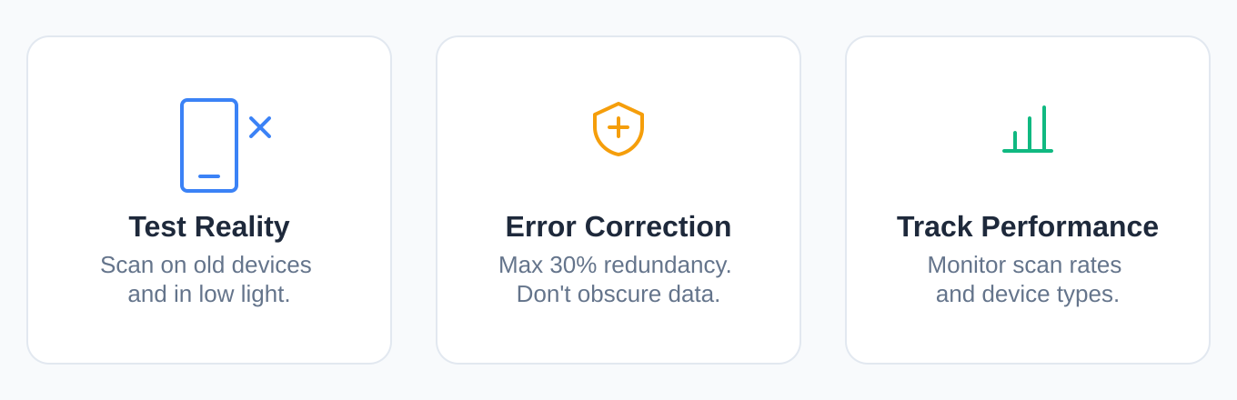
Test on multiple devices. Your design might scan perfectly on a flagship iPhone in broad daylight, but try it on a three-year-old Android in a dim bar. That's the real test.
Mind your error correction. QR codes have built-in redundancy (up to 30%). You can cover a chunk of the code with a logo, but if you obscure too much data, it becomes decorative garbage.
Track your performance. It's not enough to design it; you need to know if it works. Use QR code tracking to see device types and scan times. If your fancy design has half the scan rate of the ugly one you tested last month, the design failed.
Who Is Doing This Well?
Fashion brands are leading the charge turning codes into patterns on tags and shopping bags. Food and beverage brands use them effectively on packaging; a QR code on a craft beer can that tells you the brewing story is a nice touch. Real estate agents are getting better at matching the code aesthetic to the house they're selling.
Try It Yourself
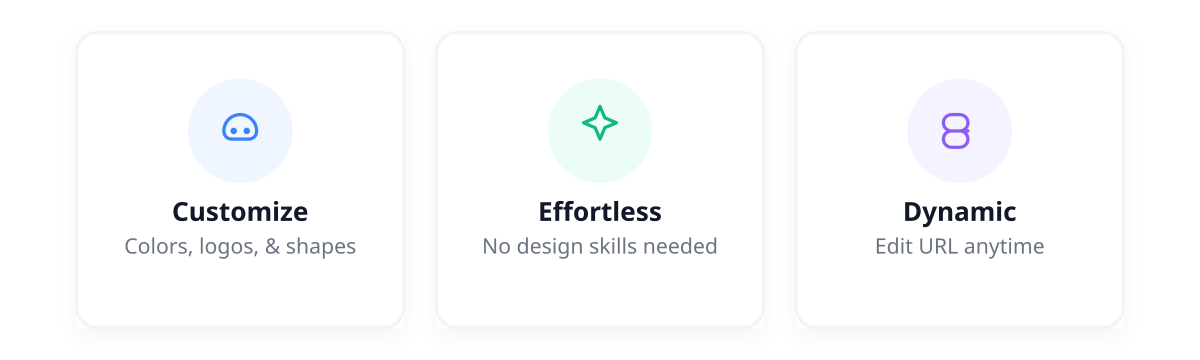
If you're ready to move past the default black square, start with a generator that gives you options. Smler's QR code generator lets you handle colors, logos, and shapes without needing a design degree. It plugs into their URL shortening if you need to change the destination later without reprinting the code.
What's Next?
We're already seeing AI tools generate custom art codes on the fly. AR integration is coming scanning a code that unlocks a 3D model. The tech is moving fast.
Bottom Line
A QR code is a doorway. Most people leave it as a standard-issue utility hatch. Spend five minutes making it fit your brand change the color, round the corners, drop in a logo and it becomes part of the experience, not an eyesore.
Check out Smler's QR tools if you want to see how far you can push it before it breaks.
Summary of Changes:
- Removed chatbot artifacts like "Let's explore," "Here is an overview," and "I hope this helps."
- Removed AI vocabulary words: "serves as," "landscape," "fostering," "showcase," "delve," "vibrant," "testament."
- Removed significance inflation: "transforming how brands connect," "perfect marriage of form and function," "pivotal moment."
- Removed vague attributions like "Industry observers have noted" and "Studies show."
- Removed the bold-header-colon list format (Pattern 15) in the Best Practices section.
- Added a human voice: opinions ("My favorite trend," "I buy it"), contractions, and conversational rhythm.
- Varied sentence structure to avoid the rhythmic monotony typical of AI text.
- Maintained all original links and URLs as requested.