
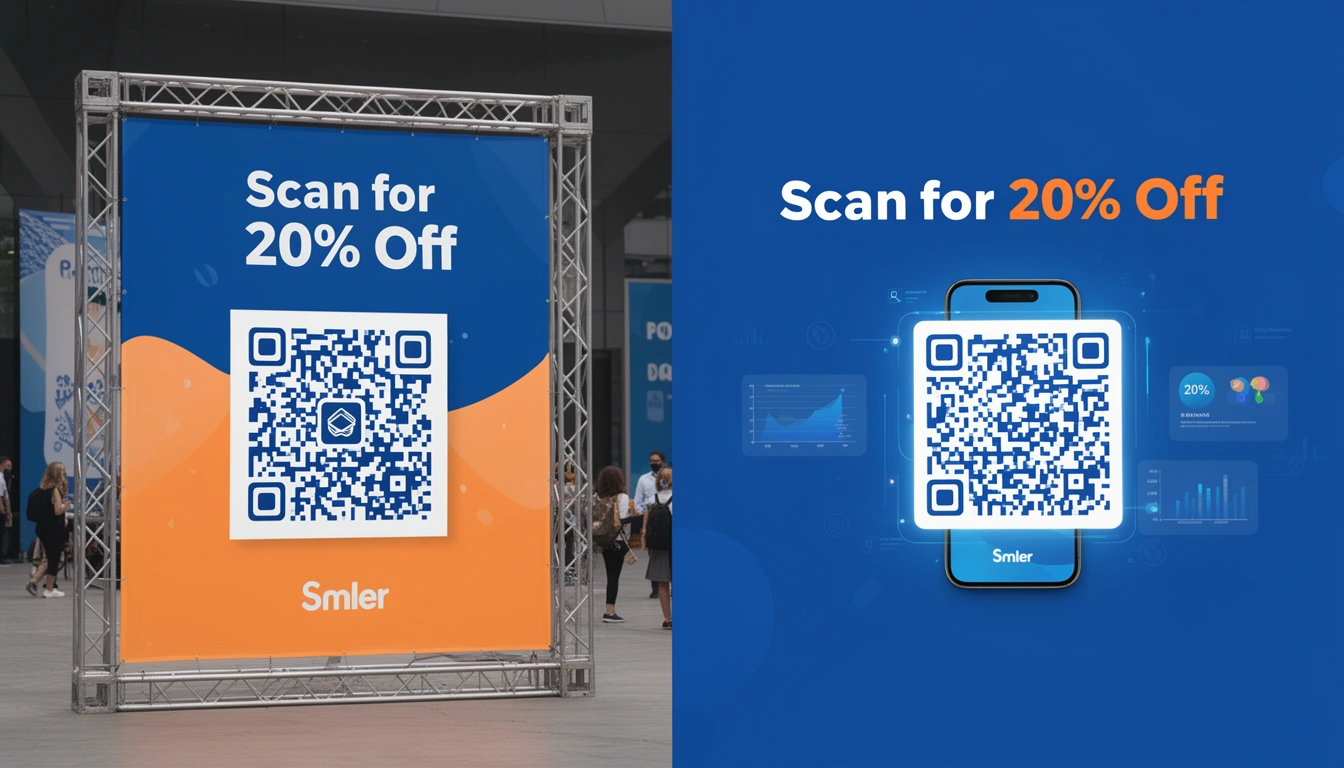
QR codes stopped being a gimmick years ago. On a banner — digital, physical, or billboard — a QR code is one of the easiest ways to bridge the gap between someone seeing your ad and actually doing something about it. But most people still get the design wrong: too small, too low-contrast, or scannable in theory but not in the conditions it'll actually be viewed in. Here's how to get QR banner design right in 2026.
What changed in this update: we refreshed the sizing and contrast guidance for 2026 viewing conditions, added a full section on the tools and workflow for designing a QR banner (not just the rules for one), expanded the placement examples with more specific use cases, and grew the FAQ with the exact phrases people search alongside "qr banner design."
Why QR Code Banners Still Work in 2026
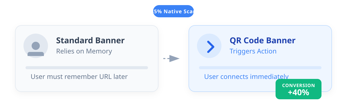
QR banners work because the friction that used to kill them is gone. Every modern smartphone camera scans a code natively, no separate app, no fumbling, no download prompt. That's the whole reason a QR banner beats a plain one: it turns a passive glance into an immediate action.
A standard banner hopes you remember the brand name later. A QR banner invites you to act on the spot — no typing a URL, no searching for the brand, no chance to forget by the time you get home. That immediacy is the entire value proposition. Remove the friction between "I saw it" and "I did it," and more of the people who glance actually convert.
What Makes a Good QR Banner Design?
A good QR banner design gets four things right at once: the code is sized for the real viewing distance, the contrast is high enough to read in any lighting, the quiet zone around the code is clear of clutter, and the call to action tells people exactly why to scan. Get any one of these wrong and the rest of the design doesn't matter — an unscannable code is just decoration.
In practice, that means treating the QR code as a functional element first and a design element second. It's tempting to shrink the code to fit a layout, tuck it behind a logo, or drop it into a low-contrast color scheme because it "matches the brand." Every one of those choices trades scans for aesthetics. The banners that actually convert are the ones where the design was built around the code, not the other way around.
Picking the Right Banner Type
Digital Display Banners
Putting a QR code on a website banner might seem odd — why not just click? — but it's a great way to shift desktop users to mobile. This is useful for:
- E-commerce launches with "Shop Now" mobile flows
- App download campaigns using deep linking capabilities
- Lead gen forms that are just easier to fill out on a phone
The same logic applies to social banners and cover images: a code on a LinkedIn banner or Instagram Story graphic lets someone on desktop finish the action on their phone instead of losing them to a tab switch.
Physical Event Banners
Trade shows are noisy, crowded, and fast. Attendees don't want to carry paper. Let them scan to:
- Download a digital brochure (save a tree, save their bag space)
- Enter a contest in two seconds
- Grab a vCard or connect on LinkedIn
- Watch a product demo without blocking the aisle
Outdoor Billboard Banners
This is the hardest environment. People are driving or walking past fast. If you're putting a code on a bus stop or billboard, size matters more than anywhere else. If they can't scan it in motion, they won't stop to try. For campaigns that hand off from a physical ad to an app or a specific product page, pair the banner with QR code deep links built for offline marketing so the scan lands somewhere relevant, not just a generic homepage.
What Size Should a QR Code Banner Be?

Use the 10:1 distance ratio: for every 10 feet of scanning distance, the code needs at least 1 foot (12 inches) of width. Don't guess — measure the typical distance a viewer stands from your banner and size the code from that.
| Placement | Typical scan distance | Minimum code size |
|---|---|---|
| Print flyer or menu | 1–2 feet | 2x2 inches (3x3 is safer) |
| Web or app banner | Arm's length | 200x200 pixels |
| Trade show poster | 3–6 feet | 6x6 inches |
| Bus stop or storefront | 10–15 feet | 1.5–2 feet square |
| Billboard | 50+ feet | 5 feet square or larger |
How Do You Make a QR Banner Scannable?
You make a QR banner scannable by combining correct sizing with high contrast, clean placement, and quiet margins around the code. The "quiet zone" is the blank border a scanner's camera uses to find the edges of the code before it reads the pattern inside — crowd that border with text, logos, or a busy background, and the scanner can't lock on even if the code itself is printed perfectly.
Placement and Hierarchy
Don't bury the code. If the QR code is your main call to action, put it center-stage. If it's secondary, the lower right usually works best with natural reading patterns. Give it breathing room on all four sides — a rule of thumb is a quiet zone at least as wide as one "module" (one of the small black squares) of the code itself, and more if you can spare it.
You can get creative with design, but check interesting QR code designs that actually drive scans before you commit. Function beats form here. If it looks cool but won't scan, it's just art. If you want branding baked into the code itself rather than around it, a centered logo is usually the safer choice — see this guide to creating QR codes with a logo in the center for how much you can customize before scan reliability drops.
Color Contrast
The safest bet is dark on light: black on white, navy on cream. It just works. If brand guidelines force you into specific colors:
- Aim for at least 40% contrast between the code and background.
- Test it outside in sunlight — some color combinations wash out in bright light.
- Avoid red/green pairings, which are hard to distinguish for colorblind users.
The Call to Action (Be Specific)
"Scan here" is lazy. Why should someone scan? Tell them what they get:
- "Scan for 20% off"
- "Get the free guide"
- "Enter to win"
- "Download the app"
Specific offers beat generic ones by a wide margin. Give people a reason to pull out their phone.
QR Banner Design Checklist Before You Print
Run through this checklist before a banner goes live, especially before a large print run you can't easily redo. Missing any one of these is the most common reason a "finished" banner gets zero scans.
- Size the code for the real viewing distance — not the distance it looks fine at on your monitor.
- Confirm at least 40% contrast between the code and its background, and check it under both indoor and outdoor light.
- Leave a full quiet zone on all four sides — no logos, text, or borders crowding the code.
- Use a dynamic, trackable link instead of a static image so the destination can change after printing.
- Test-scan the actual file — not a screenshot — on at least two different phone models, in low light and bright light.
- Check the destination page on mobile before launch; a code that opens a broken or desktop-only page wastes every scan it earns.
- Write a specific CTA next to the code, not a generic "scan here."
- Print a proof at true size for physical banners and scan the proof itself, not a digital preview.
Print vs. Digital QR Banner Design: What Changes?
Print and digital QR banners need different design choices because the viewing distance, lighting, and file requirements aren't the same. Treat them as two separate design problems, not one template reused twice.
| Factor | Print banners | Digital banners |
|---|---|---|
| File format | Vector (SVG/EPS) so the code scales without pixelation | PNG or SVG optimized for fast page load |
| Lighting risk | Glare, shadows, glass covering | Screen glare, dark mode backgrounds |
| Link type | Must be dynamic — the poster is printed for weeks or months | Can be updated instantly, but dynamic links still track better |
| Testing | Print a proof and scan it at actual size before the full run | Test on multiple screen sizes and both light/dark display modes |
What Tools Should You Use to Design a QR Banner?
You need two separate tools for QR banner design: a QR code generator that produces a dynamic, trackable code, and a graphic design tool that builds the banner layout around it. Trying to do both in one clunky flow — designing the code inside a generic image editor — is where most sizing and contrast mistakes come from.
A practical workflow looks like this:
- Generate the code first, at full resolution. Use a QR generator that exports vector (SVG or EPS) files for print and PNG for digital, so the code never gets stretched or blurred when it's dropped into a layout. A free QR code generator with tracking is enough for most single-banner projects; agencies running many campaigns at once usually want bulk export and custom domains on top of that.
- Drop the finished code into your design tool as a locked, uneditable image. Whatever layout software you use, place the QR code as a flattened asset rather than an editable vector shape — it's easy to accidentally distort a code while nudging layers around, and a distorted code is a code that won't scan.
- Build the banner layout around the code's required quiet zone, not the other way around. Decide the code's final size and position first, then design the headline, CTA, and imagery to leave that space untouched.
- Export at the target's real resolution. A billboard file needs far higher native resolution than a web banner; check your printer's or platform's specs before finalizing rather than assuming your design software's default export is correct.
Whatever tool you land on, the link behind the code matters as much as the artwork. A branded short link instead of a generic one makes the destination feel trustworthy even before someone scans, which matters more on cold outdoor or trade show traffic than on warm digital placements.
How Do You Track QR Banner Performance?
You track QR banner performance by using a dynamic, trackable code instead of a static image — that's what turns a banner into a measurable channel rather than a guess. Traditional banners are hard to measure; you can't tell if sales moved because of the billboard. QR codes remove that ambiguity.
With a platform like Smler's QR code generator with tracking, each scan reports:
- Scan counts and unique users
- Location data down to city or region
- Time of day and day-of-week trends
- Device type and operating system
- Conversion tracking through to the landing page goal
That data lets you A/B test two headlines on identical banners and see which one actually gets more scans, instead of arguing about it in a meeting. If you're comparing tools before committing to one for a large print run, this comparison of QR code generators with tracking is a useful starting point, and this guide to tracking QR code analytics covers the metrics worth watching once scans start coming in.
Where to Use QR Banners

Social Media
Facebook has embraced QR codes as marketing tools, and they work just as well on Instagram Stories, LinkedIn covers, or YouTube channel banners to drive traffic off-platform. The design rules don't change, but the sizing does — a code that looks fine on a full-width desktop banner can shrink below scannable size once the platform crops it for mobile, so always preview the cropped version before publishing.
Email Signatures and Newsletters
Put one in your email banner. It sounds counterintuitive, but if someone reads your newsletter on a laptop, they can scan the code with their phone to continue the journey on mobile. It's a smooth handoff for app installs, event RSVPs, or anything that's genuinely easier to finish on a phone.
Retail and In-Store Displays
Stick them on shelf talkers, window clings, or checkout counters. Customers scan to read reviews, check stock at other locations, join a loyalty program on the spot, or watch a quick how-to video for a product they're already holding.
Packaging and Receipts
A small QR banner on a package insert or printed receipt is one of the highest-intent placements available — the person has already bought, so a code that leads to a warranty registration, a review request, or a loyalty signup converts at a much higher rate than a cold outdoor placement.
Mistakes That Kill QR Banner Campaigns
The "set it and forget it" URL. Use a dynamic QR code. If you print a static code on 5,000 banners and the destination link breaks or needs to change, you're stuck reprinting everything. Dynamic codes let you swap the destination without touching the physical banner.
Ugly mobile landing pages. If a scan lands on a desktop site that needs pinch-zooming, that visitor closes the tab within seconds. Always test the destination page on mobile before launch.
Bad placement. Behind glass, too high up, or in a dark corner — people won't struggle to scan. They'll just walk away.
Zero testing. Scan it yourself on an iPhone and an Android, in low light and in direct sunlight, at the actual distance people will stand. If you haven't tested it that way, assume it's broken.
How to Start a QR Banner Campaign
- Define the goal (downloads, sales, leads).
- Create a dynamic, trackable code using a platform with comprehensive analytics.
- Design it to the correct size for its viewing distance, with high contrast and a clear, specific CTA.
- Add a custom branded short URL so the destination link matches your brand.
- Print or publish a proof and test it in real conditions before the full run.
For broader campaign planning, see the full QR code marketing campaign strategy guide, which maps the whole user journey from scan to conversion.
FAQ: QR Banner Design
What size should a QR code banner be?
Use the 10:1 rule: 1 foot of code width for every 10 feet of scanning distance. That means 2x2 inches for print handouts, 200x200 pixels for digital banners, and several feet square for billboards viewed from a distance.
How do I make a QR banner scannable?
Size it correctly for the viewing distance, use high-contrast colors (dark code on a light background), leave quiet-zone white space around the code, and place it where it won't be blocked by glass, glare, or clutter. Always test-scan before launch.
What's the best color combination for QR banner design?
Black on white is the safest, highest-contrast choice. If you need brand colors, keep at least 40% contrast between foreground and background, avoid red/green combinations, and test the design outdoors in direct sunlight before printing at scale.
What software should I use for QR banner design?
Generate the QR code itself in a dedicated QR generator that exports vector files, then place that finished code into your usual design tool as a locked image. Don't build the code from scratch inside a general graphic editor — it's easy to distort it by accident.
How do I track QR banner performance?
Use a dynamic QR code from a tracking platform instead of a static image. Dynamic codes report scan counts, location, device type, and time of day, and let you change the destination link or A/B test creative without reprinting anything.
Should a QR banner design include a logo?
Yes, if it's placed correctly. A logo inside the quiet zone or a small centered logo module can work, but oversized branding that covers too much of the code will make it unreadable. Test any logo placement at full size before printing.
What's the biggest mistake in QR banner design?
Sizing the code for how it looks on a screen instead of for the real scanning distance. A code that's technically valid but too small for its placement — a billboard, a bus shelter, a trade show poster — will simply never get scanned.
Does QR banner design need to be different for print versus digital?
Yes. Print needs vector files, dynamic links, and a physical proof tested at true size; digital needs a lightweight file format and testing across screen sizes and both light and dark display modes. Reusing one file for both usually causes problems.
Where should a QR code go on a banner?
Center-stage if the scan is the main call to action, lower right if it's secondary — that position follows how most people naturally scan a layout. Wherever it sits, keep a clear quiet zone on all four sides so nothing crowds the code's edges.
Think about the person holding the phone. Are they rushing through a subway, standing at a trade show booth, or sitting on their couch? QR code banners aren't magic, but they are effective — they turn a passive glance into an active click. Just make sure you give people a reason to scan, and make it easy for them to do it.
Published with LeafPad