QR codes used to be fragile things. You printed them in black and white, kept your hands off the design, and hoped for the best. Now, you can stick a logo right in the middle and the thing still works. It’s a small shift, but it changes how people interact with them.
This is how to get icon QR codes right in 2026 without breaking them.
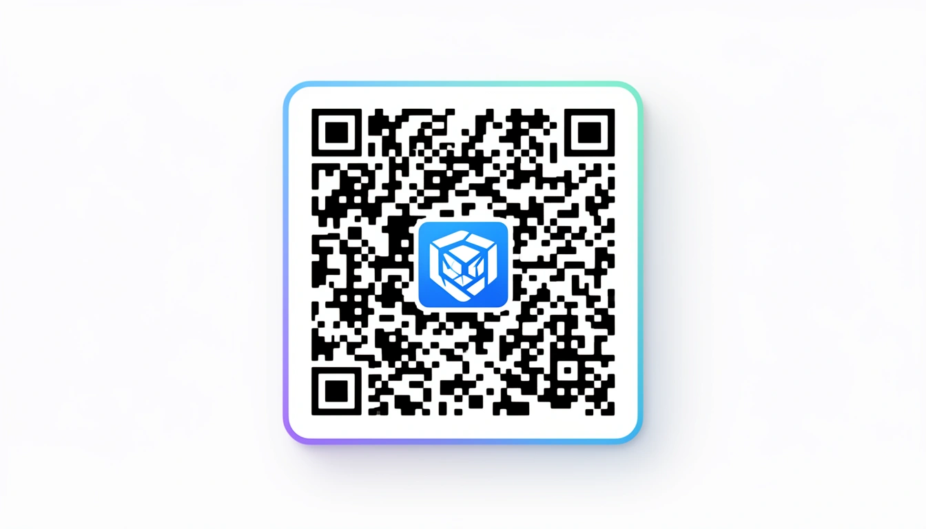
What Are Icon QR Codes?

It’s a standard QR code with a logo slapped in the center.
Technically, it’s a bit more complicated than that. You’re asking a scanner to read a code that’s partially covered. But when the balance is right when the logo is visible but the code still scans you get something that looks like it belongs to your brand, not a utility company.
Why Bother?
Trust, mostly. I don't know about you, but I hesitate before scanning a naked black-and-white code on a street pole. Is it a menu? Is it malware? A code with a familiar logo answers that question before I even pull out my phone.
They look better. A raw QR code disrupts a good design. It’s a visual speed bump. Branded codes blend in. We’ve seen this firsthand our write-up on interesting QR codes showed that people actually stop to look at codes that don't look like garbage.
The Technical Stuff (Don't Skip This)
If you just drag a logo onto a QR code, it will break. You need to understand error correction.
QR codes have four levels of redundancy. Most default to low. You need to crank it up.
- L (Low): 7% data recovery.
- M (Medium): 15%.
- Q (Quartile): 25%.
- H (High): 30%.
Use H-Level. Always. This setting tells the code to duplicate its data points so it can afford to lose the center pixels to your logo. If you use a lower setting, the scanner has no backup data, and your code becomes a decorative square.
Sizing Rules
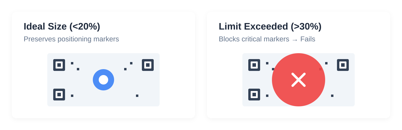
There is a limit to how big your ego er, logo can be.
Keep the icon under 30% of the total area. I usually aim for 20%. If you cross that 30% line, you delete critical positioning markers. The scanner won't know which way is up, and it will fail.
Designing the Icon
Keep it simple. Your detailed corporate crest with the tiny latin motto is not going to survive at 2cm wide. Use the flat, simplified version of your logo.
Contrast. If the code is black, don't use a dark gray logo. You need a sharp edge.
Test on a bad camera. Your iPhone 16 Pro will scan anything. Go find an old Android with a cracked screen protector. If that phone scans it, you’re safe to print.
Making It with Smler
You can do this in Photoshop, but tools like Smler's free QR code generator handle the error correction logic for you.
The workflow is pretty standard:
- Drop in your link.
- Upload the logo.
- Adjust until it looks right.
- Download.
The real value isn't the generator, though. It's the analytics. You can see if that fancy logo actually convinced people to scan, or if they just ignored it like every other code.
Where This Works
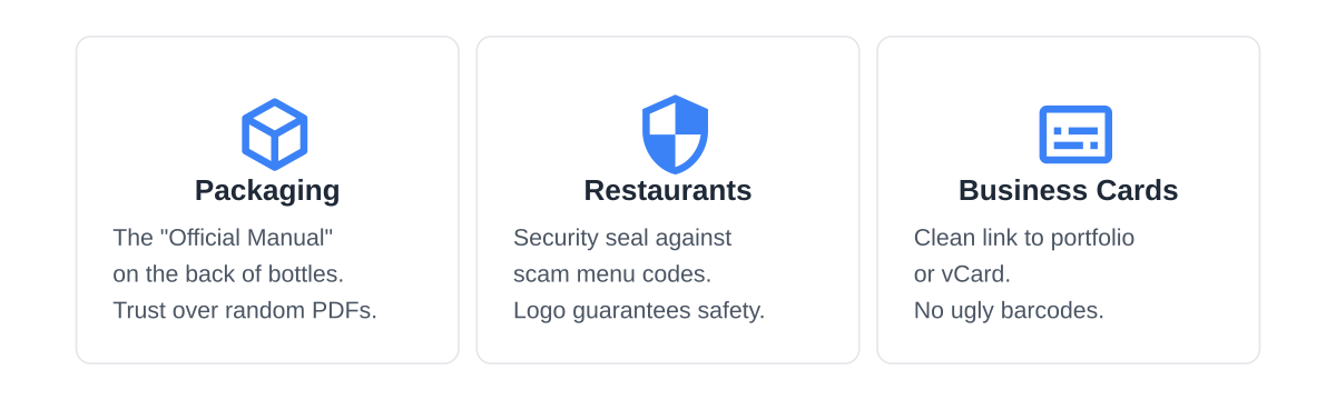
Packaging. Throw one on the back of a bottle. The logo tells the customer, "This is the official manual, not a random PDF hosted on a dodgy drive."
Restaurants. This is the big one. Diners got burned by scam menu codes during the pandemic. A restaurant logo in the center is a security seal.
Business Cards. It saves you from handing someone a card with a giant, ugly barcode on it. Link it to a portfolio or a vCard.
Mistakes That Will Ruin You
The logo is too big. I see this constantly. Designers push the logo size because it looks better. It looks great. It doesn't scan. Shrink it.
Low-res art. Don't use a screenshot of your logo. Use a vector.
Printing it too small. A QR code on a screen is easy to scan. A printed QR code needs to be at least 2x2 centimeters. Anything smaller and the camera can't resolve the lines.
What’s Trending in 2026?
Minimalism is back. Black on white, small logos.
We're also seeing digital-only tricks, like animated icons for screens. They pulse or rotate slightly. It grabs attention without breaking the code. We cover more of these in our guide on QR code types.
The Bottom Line
Icon QR codes are worth the effort. They look professional and they build trust. But they are unforgiving if you get the technical settings wrong.
Use high error correction. Keep the logo small. Test on a bad phone.
If you’re deploying these on product packaging or marketing materials, the branding lift is worth the extra fifteen minutes of testing. Just make sure it scans before you print 10,000 of them.
Published with LeafPad