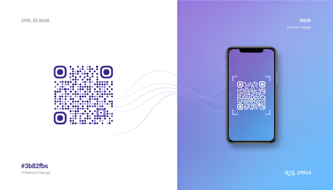
Dot QR codes are the better-looking sibling of the standard QR code. Instead of rigid squares, they use dots. It sounds minor, but if you've ever tried to put a QR code on a luxury perfume box or a sleek event poster, you know the struggle. The standard black square looks like a mistake. Dots look like they belong.
They scan the exact same way. Your phone doesn't care if the data points are squares or circles. But to the human eye, dots look softer less "industrial barcode" and more "part of the design."
The difference is aesthetic

Functionally, dot QR codes are identical to traditional ones. They store the same data. The difference is purely visual. The rounded elements feel less mechanical, which helps when you're trying to maintain a specific brand vibe.
I've noticed a few practical benefits:
- Visual integration: Dots blend better with curves and organic shapes in logos.
- Perception: People seem to trust them more, probably because they look less like a tracking pixel.
- Scannability: Reliable, assuming you generate them correctly. They still support the standard 30% error correction.
Why they matter for design
For brands that care about visual consistency, dot QR codes solve a real problem. Standard QR codes force a compromise: functionality vs. aesthetics. You either hide the code or let it clash with your design.
Consider a luxury fashion print campaign. A blocky QR code undermines the aesthetic. A dot QR code doesn't. This is useful for:
Premium Packaging: High-end products can use dot QR codes for authentication or storytelling without looking cheap.
Event Materials: Concert posters and wristbands look better with dots. They feel intentional, not tacked on.
Retail Displays: In-store signage can include the code without disrupting the shopping environment.
As we covered in our guide on QR code use cases, design directly impacts scan rates. In aesthetic-focused campaigns, dot codes win.
Technical details you need to know
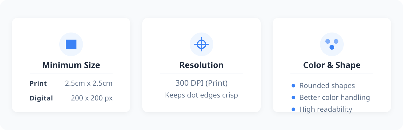
The aesthetic upgrade comes with a few constraints. Dot QR codes need slightly more space than standard codes to remain scannable. The circular elements need breathing room to stay distinct.
Sizing
Aim for these minimums:
- Print: 2.5cm x 2.5cm (slightly larger than standard codes)
- Digital: 200 x 200 pixels minimum
- Resolution: 300 DPI for print to keep dot edges crisp
Color and contrast
While QR code colors don't have to be black and white, dot QR codes handle color better than square pixels. The rounded shapes maintain readability across more color combinations.
But basic rules still apply:
- Keep at least 60% contrast between dots and background
- Dark dots on light backgrounds scan best
- Test on different phones and lighting
- Avoid gradient backgrounds
Combining style with substance
The real value shows up when you pair good design with smart functionality. This is where a platform like Smler helps.
Dynamic links and analytics
Using Smler's QR code generator, you can point your dot QR code at a dynamic URL. This lets you:
- Change the destination without reprinting the code
- See scan analytics location, device, time
- Run A/B tests on landing pages
- Watch campaign performance in real-time
This turns a static image into a data source. For more on this, see our deep linking analytics guide.
Device-based routing
If you're promoting an app, dot QR codes can route users based on their device. iPhone users go to the App Store; Android users go to Google Play. Smler handles this with device-based routing, so you don't have to pick one platform.
Branded short links
Even though users don't type QR code URLs, using branded short links behind the code has benefits. It looks professional if someone checks the link details, and it keeps your analytics consistent. See how branded links fit into the bigger picture.
Implementation tips
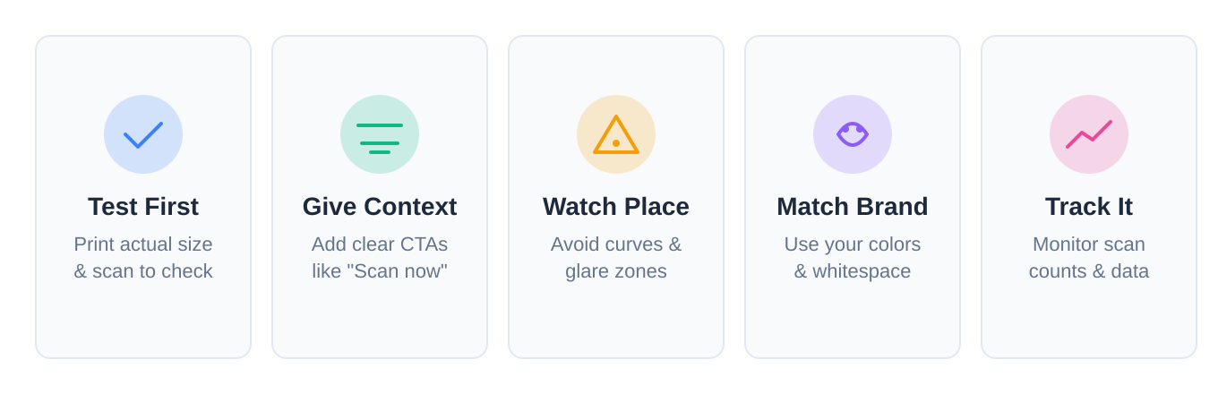
A few principles that actually matter:
Test before you print. Print a sample at actual size. Scan it with an old phone and a new phone in bad lighting. This prevents expensive mistakes.
Tell people what to do. Even a beautiful code needs context. "Scan for 20% off" works better than a naked code.
Watch the placement. Don't put it on a curved surface or in a glare zone. Make sure people can reach it.
Match your brand. Use your colors. Give it space. Make it feel part of the design, not an afterthought.
Track it. Use QR code tracking to see what works. Scan counts are just the start.
Where they work best
Fashion brands adopted dot QR codes early because they can't afford ugly packaging. You'll see them on clothing tags and lookbooks. Food and beverage companies use them on wine labels pairing suggestions, origin stories. Real estate agents use them for virtual tours. They look professional, which matters when you're selling a house. Museums use them because they don't distract from the art.
Getting started
To try it, visit Smler's free QR code generator.
- Enter your URL.
- Select dot style.
- Pick your colors.
- Download (SVG for print, PNG for digital).
- Test it.
For bulk campaigns, Smler's bulk shortening can generate hundreds at once.
What's next
Dot QR codes are just one step toward making these tools less ugly. As QR usage grows payments, auth, tickets design will keep evolving. We're seeing animated codes, gradients, and better logo integration. The challenge is keeping them scannable.
For a deeper look at options, see our guide to QR code types and formats.
If you care about how your brand looks, dot QR codes are worth it. They work the same, but they don't look like an afterthought.
Published with LeafPad