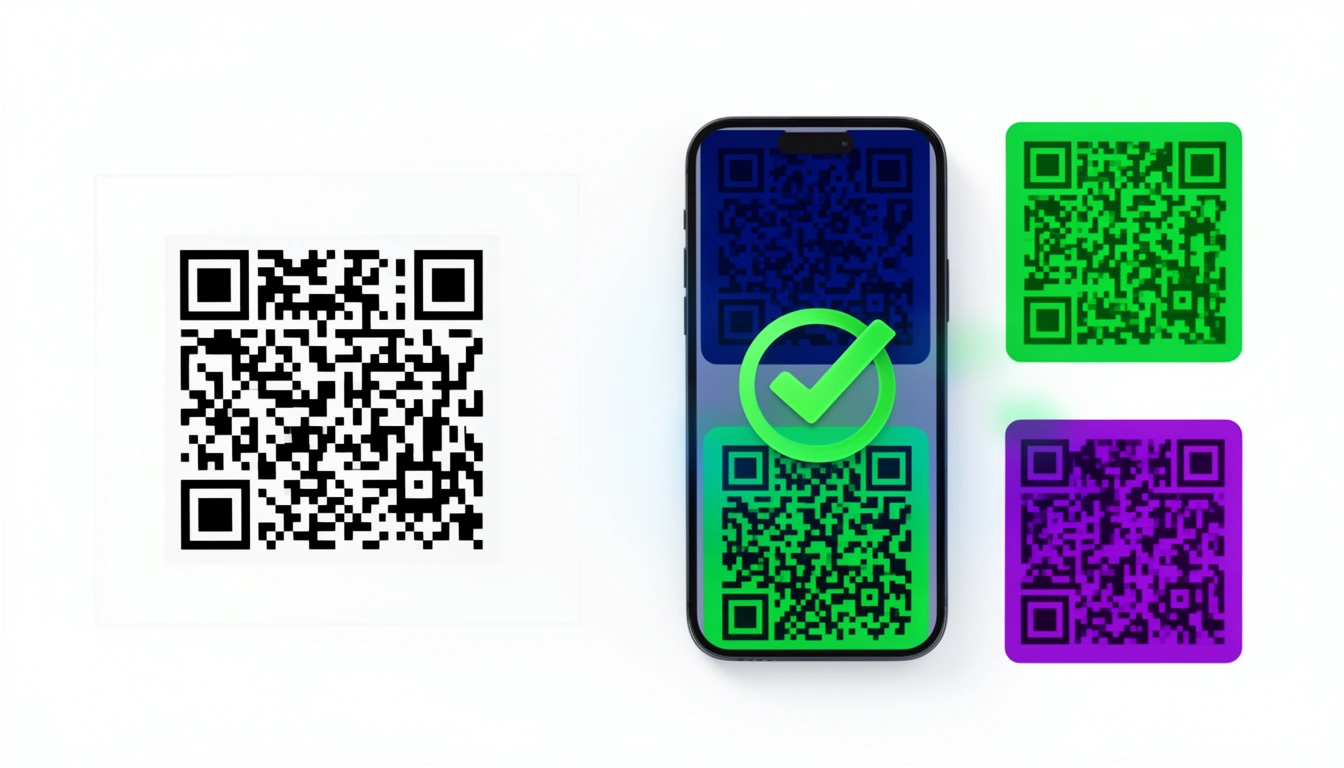
Can QR codes be colorful? Yes. Do they have to be black and white? No. The monochrome look is just a safety standard from the 90s that stuck around longer than it needed to.
Modern phone cameras are good enough to handle color. But there's a catch: if you do it wrong, the code won't scan. Here is how to do it right.
Why Are Most QR Codes Black and White?

It's about contrast, not style. When Denso Wave built the first QR codes in 1994 for Japanese auto factories, they needed something industrial scanners could read instantly, without fail, in a dirty warehouse.
Black on white gives you the sharpest possible edge. That's it. It became the standard because it was safe, not because it was a design choice.
Phone cameras are better now. The software is smarter. You don't need to stick to the default if you know what you're doing.
The Technical Constraints
Scanners are simple beasts. They look for two things: dark spots and light spots.
Contrast is the only rule that matters. The scanner needs to see a clear difference between the data squares (modules) and the background. If the contrast is low, the scanner hesitates or fails.
Dark goes on light. The data modules need to be darker than the background. Most scanners are programmed to hunt for dark shapes on a light field. If you try to flip it white code on a black background most standard apps will choke. They'll stare at the code and do nothing.
Brightness beats color. A dark red and a dark green might look like different colors to you, but if they have the same brightness value, the scanner sees them as identical. That breaks the code.
What Actually Works
Here are the combinations that tend to scan reliably.
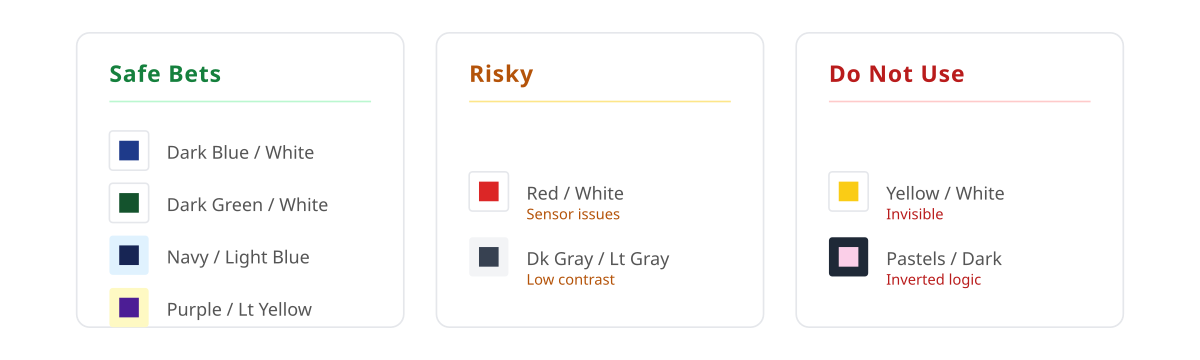
Safe Bets
- Dark blue on white: Almost as safe as black.
- Dark green on white: Good for "natural" branding.
- Navy on light blue: Professional, clean.
- Dark purple on light yellow: distinctive, but high contrast.
Risky
- Red on white: Red can be tricky. Some camera sensors struggle with it in artificial light.
- Dark gray on light gray: It works, but you have a tiny margin for error.
Do Not Use
- Yellow on white: Invisible to a scanner.
- Pastels on dark backgrounds: The scanner expects the dark part to be the code, not the background. You can sometimes force this to work with specialized design, but it's rarely worth the headache.
- Metallics: Glare destroys the pattern.
If you look at the types of QR codes, you'll see that error correction matters here. If you boost error correction to "High," you can get away with slightly lower contrast, but you sacrifice data density.
Test Before You Print
I cannot stress this enough. Colors look different on your calibrated monitor than they do on a cheap flyer printed on matte paper.
- Scan it with an old phone. If a five-year-old Android can read it, you're safe.
- Scan it in the dark. Try a dimly lit room.
- Scan it from an angle. Hold the phone tilted.
- Print a sample. RGB-to-CMYK conversion often darkens or muddies colors. Check the printed version.
You can use Smler's free QR code generator with tracking to preview the code on your phone screen immediately.
Advanced Tricks
Gradients These are popular but dangerous. The scanner needs contrast across the entire code. If a gradient fades from dark blue to light blue, the light blue section might fail. Always run the gradient from dark to darker, not light to dark.
Logos You can slap a logo in the middle. QR codes have redundancy built-in (up to 30% error correction). The logo covers some data, but the code usually recovers it. Just don't let the logo blend into the data color.
Two-Tone You can color the three big corner squares (position markers) differently from the rest of the code. It draws the eye. Just ensure both colors are dark enough against the background.
Where Colored Codes Make Sense
It's not just decoration.
- Luxury: A black code looks cheap on a gold perfume box.
- Eco-products: Green codes on brown cardboard reinforce the brand vibe.
- Events: Color-coded codes help attendees distinguish the Wi-Fi login from the schedule link.
There are more interesting QR codes with creative designs here that show how far you can push the format.
Common Failures
I've seen brands print thousands of these only to realize nobody could scan them.
Contrast was too low. The designer picked a "sophisticated" charcoal grey on a "soft" white. It looked great. It didn't scan.
They inverted the colors. White code on a black poster looks cool. It is also the number one way to ensure zero scans.
They forgot the quiet zone. The quiet zone is the white border around the code. If you run the background color right up to the edge, the scanner can't find the start of the code.
They didn't check for color blindness. If a colorblind user can't distinguish the colors, there's a good chance a scanner will struggle too.
Summary
You can use color. You should use color if it fits your brand. But treat the QR code like a technical tool, not just a graphic element.
Use Smler's QR code generator to build it. Test it on three different phones. Print it. Scan the print. If it works, run with it. If it doesn't, go darker.
For more on how these fit into a broader strategy, see the benefits of QR codes for business or explore QR code use cases that boost sales.
Published with LeafPad